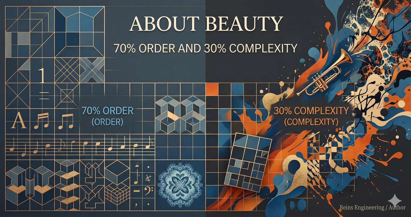
 Image: AI generated
70% Order, 30% Complexity
Take anything beautiful apart and it is astonishingly regular.
Bach’s fugues follow the rules of counterpoint strictly. Le Corbusier’s architecture stands on a modular grid. The golden ratio of typography, the harmony of music, the perspective of painting — most of beauty is mathematics.
Fractal research has quantified this. The fractal dimension at which humans feel the most beauty is D ≈ 1.3 (Spehar et al. 2003, Taylor et al. 2011). With D=1.0 being perfect order and D=2.0 being perfect chaos, 1.3 is roughly 70% order and 30% complexity. The same result has been confirmed repeatedly across natural landscapes, mathematical fractals, Pollock’s paintings, and in children and adults alike. When we look at a D=1.3 pattern, stress recovers 60% faster.
Music points to the same ratio. Voss & Clarke (1978) found that, between white noise (perfectly random) and brown noise (excessively correlated), humans consistently prefer pink noise (1/f) — the exact mathematical midpoint between predictability and surprise.
So is order alone beautiful? No.
Bach is great not because he kept the counterpoint, but because, on top of the counterpoint, he placed a single note in an unexpected position. Le Corbusier is great because, on top of the grid, he twisted a single column. Jazz is beautiful because there is improvisation on top of the fixed form that is the chord progression.
70% order makes the foundation, and 30% complexity makes the beauty. Complexity without order is noise; order without complexity is boredom.
Design Is Verifiable
The saying “design is subjective” is only half true.
| Decidable (70%) | Undecidable (30%) |
|---|---|
| An empty cell when a 4-column grid has 1+3 | Intentional asymmetry of the hero section |
| 13px spacing in an 8px system | Off-grid placement for emphasis |
| Color contrast below 4.5:1 | A low-contrast choice for mood |
| A font size not in the type scale | A deliberate size deviation in the title |
| z-index outside the declared layers | — |
The left side can all be judged by a machine. Rules exist declaratively, and the question is whether the implementation follows those rules. It has the same structure as go test validating code.
The right side is decided by a human. But once decided, it is made explicit.
@allow-break: "intentional asymmetry of the hero section"
What this annotation does: it declares to the machine, “this is not a bug, it is intent.” Now the machine leaves this exception untouched and validates only the remaining 70% of order.
57 : 23 : 20
Deque Systems analyzed roughly 300,000 accessibility issues across more than 13,000 pages (Deque, 2021):
| Area | Ratio | Who Decides |
|---|---|---|
| Detectable by full automation | 57% | Machine (deterministic rules) |
| Detectable semi-automatically (AI-assisted) | 23% | AI + machine (pattern recognition + rules) |
| Only a human can judge | 20% | Human |
The 57% is the realm of order, where the rules are clear. Color contrast below 4.5:1, missing alt text, no keyboard access — the machine judges without asking.
The 20% is the realm of complexity that only a human can judge. “Is this flow intuitive?”, “Does this alt text actually convey meaning?” — you have to understand the context to answer.
The 23% is the boundary. It is the area not fully captured by rules, but catchable once an AI recognizes the pattern. It is where AI judges by context: “Is this intentional asymmetry or a mistake?”
Anthropic’s Evals framework (“Demystifying Evals for AI Agents”, 2026) reflects exactly these three layers. It divides graders into three kinds: code-based, AI-based, and human-based. And the official recommendation is:
“Use a deterministic (code-based) grader wherever possible, use an LLM grader only when necessary and as a supplement, and use a human grader only for calibration.”
Anthropic itself acknowledges the supremacy of deterministic validation. The recommendation to use “code-based wherever possible” points to the 57% area. In the 23% boundary area handled by the LLM grader, the AI mediates between order and complexity. The remaining 20% is decided by a human.
There is no need to ask an LLM about a grid violation. That is the 57% area. There is no need to ask an LLM about intentional asymmetry either. That is the 20% a human has already decided. What AI is needed for is the 23% in between — the boundary area where rules exist but context is required.
Lock the Formal, Allow the Informal
This structure is already at work in code.
filefunc  — locks code structure with 22 rules. Exceptions via //filefunc:allow
yongol    — locks layer consistency with 10 SSOTs. Exceptions via explicit override
Hurl      — locks API behavior in plain text. No exceptions (behavior must not change)
Apply the same structure to design:
Design system SSOT → declares grid, type scale, color, spacing
Validation CLI     → mechanically judges whether the implementation follows the SSOT
@allow-break       → explicitly permits an intentional deviation
Ratchet            → no regression below a validation that has passed
Documents, music, video — the same principle applies to every creative domain where formal rules exist.
The 70% of Every Domain
Reins Engineering is not an AI coding tool. It is the principle of locking order deterministically and leaving only complexity to people.
It started with coding. Coding just happened to be the first proof.
“Art is free” is the prejudice of someone who has not been trained in art. The novel follows three-act structure, setup and payoff, point-of-view consistency, tense consistency. Painting follows composition, color theory, value structure, perspective. Music follows harmony, counterpoint, form. Analyze the 28,000 harmonic labels of Beethoven’s string quartets and they follow a power law — a small number of rules govern the majority (Moss et al. 2019). Picasso mastered classical drawing perfectly before he did Cubism. Coltrane played standards thousands of times before he did free jazz. Creation is internalizing the rules perfectly and then deliberately breaking them; starting without rules is noise.
The limit of Reins Engineering’s scope is precisely the ratio of order. Fractal research shows that this ratio is above 70% everywhere.
What a human must do is not keep the 70%. It is to decide the 30%. The rest is kept by the machine.
The Question
In what you make, what percentage is order?
Is a machine validating that order?
Or is a person checking it by eye every single time?
Do you believe “art is free”?
Ask Picasso.
Related
Internal
- Reins Engineering — AI with Reins — the engineering approach that locks 70% of order deterministically
- filefunc — One Concept per File — the
//filefunc:allowannotation = explicit declaration of an intentional exception - AI’s Sycophancy Bias Is a Business Feature — why an LLM cannot be an aesthetic judge
- Feedback Topology over Model IQ — same model, different environment, different result
- On Building Systems Agents Can Operate — not just code. Design too
External
- Dieter Rams, Good Design — “Nothing must be arbitrary or left to chance.”
- Tim Brown, More Meaningful Typography — modular scale: the entire typography emerges from a single ratio
- Josef Muller-Brockmann, Grid Systems in Graphic Design — the father of the grid system. “When structure is made explicit, design gains power.”
- Le Corbusier, Le Modulor — integrating an entire architecture into a single mathematical system with human proportion + the golden ratio + Fibonacci
- Daniel DeStefanis, Design Lint — a linting plugin that automatically detects layers without applied design tokens in Figma
- Toptal, Design Constraints Are Not Restraints — constraints are not oppression but a catalyst for creativity
- Sciforce, Computational Aesthetics — a history of the mathematical quantification of beauty, from Birkhoff (1933) to modern algorithms
Sources
Fractals and Aesthetic Preference
- Spehar, Clifford, Newell & Taylor, “Universal aesthetic of fractals”, Computers & Graphics 27 (2003) — preference for D=1.3~1.5 across nature, mathematics, and painting alike
- Taylor, Spehar et al., “Perceptual and Physiological Responses to Jackson Pollock’s Fractals”, Frontiers in Human Neuroscience 5:60 (2011) — 60% faster stress recovery at D=1.3
- Aks & Sprott, “Quantifying Aesthetic Preference for Chaotic Patterns” (1996) — preferred patterns averaged a fractal dimension of F=1.26
- Robles et al., “A shared fractal aesthetic across development”, Humanities and Social Sciences Communications (2020) — preference for intermediate complexity in children and adults alike
Music and Information Theory
- Voss & Clarke, “1/f noise in music”, J. Acoustical Society of America 63 (1978) — pink noise (1/f) is the mathematical midpoint between predictability and surprise
- Cheung et al., “Uncertainty and Surprise Jointly Predict Musical Pleasure”, Current Biology 29 (2019) — analysis of 80,000 chords. Low uncertainty + high surprise = maximum pleasure
- Moss et al., “Statistical Characteristics of Tonal Harmony”, PLOS ONE (2019) — Beethoven’s 28,000 harmonic labels follow a power law
- Manaris et al., “Zipf’s Law, Music Classification, and Aesthetics”, Computer Music Journal 29(1) (2005) — aesthetically pleasing music follows the Zipf-Mandelbrot law
Aesthetic Measure Theory
- Birkhoff, Aesthetic Measure, Harvard University Press (1933) — M = O/C. the first attempt to quantify beauty with mathematics
- Berlyne, Aesthetics and Psychobiology (1971) — the inverted-U curve: intermediate complexity yields maximum pleasure
- Chmiel & Schubert, “Back to the inverted-U for music preference”, Psychology of Music 45(2) (2017) — 87.7% of 57 studies support the inverted-U model
- Schmidhuber, “Driven by Compression Progress”, arXiv:0812.4360 (2009) — interestingness = the first derivative of compression progress
Neuroscience
- Ishizu & Zeki, “Toward A Brain-Based Theory of Beauty”, PLOS ONE 6(7) (2011) — both musical and visual beauty activate the medial orbitofrontal cortex (mOFC)
- Vessel, Starr & Rubin, “The brain on art”, Frontiers in Human Neuroscience 6:66 (2012) — the default mode network (DMN) is activated by the most moving art
- Reber, Schwarz & Winkielman, “Processing Fluency and Aesthetic Pleasure”, Personality and Social Psychology Review 8 (2004) — the higher the processing fluency, the more positive the aesthetic response
- Dibot et al., “Sparsity in an artificial neural network predicts beauty”, PLOS Computational Biology 19(12) (2023) — neuron sparsity explains 28~47% of the variance in beauty
Architecture and Design
- Alexander, A Pattern Language (1977) / The Nature of Order (2002-2005) — “beauty is objective, perceptible, and reproducible”
- Salingaros, “Life and Complexity in Architecture From a Thermodynamic Analogy” — L = T × H. a sense of life is maximized when something is complex yet harmonious
- Muller-Brockmann, Grid Systems in Graphic Design (1981) — “When structure is made explicit, design gains power”
- WCAG 2.1, Contrast Minimum (2018) — AA 4.5:1, AAA 7:1. fully verifiable by machine
AI Evaluation and LLM-as-Judge
- Anthropic, Demystifying Evals for AI Agents (2026) — “use a code-based grader wherever possible”
- Zheng et al., Judging LLM-as-a-Judge (2023) — position bias, verbosity bias, self-enhancement bias
- Ye et al., Justice or Prejudice?, ICLR 2025 — 12 latent biases of the LLM judge
- Zhou et al., IFEval (2023) — grading verifiable instructions with deterministic programs
- Deque Systems, Automated Testing Study (2021) — automated testing alone finds 57% of accessibility issues, 80% when IGT is included
Changelog
- 2026-05-31: Initial release